
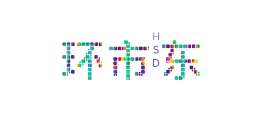
环市东是广州的初代CBD,这里拥有着繁华的商业,丰富的人文和浓厚的生活气息。Logo的设计也从其社区特色着手,多彩明亮的颜色奠定了社区的基底。大小不一的方块犹如环市东大大小小的商家,这里有白金五星大酒店,也有数十年街边小摊,所以这是一个多元化且互相扶持互相成就的社区。字母H,S,D不仅是环市东拼音首字母的缩写,也是英文单词Heritage,Splendid和Discovery的缩写,意为环市东是一个历史底蕴深厚,生活丰富精彩以及值得探索游玩的宝藏社区。
As Guangzhou’s first historical CBD, with its bustling business, rich culture and rich lifestyle, the HSD’s logo is designed with the community’s focus in mind, using bright colors to express the community’s positive and forward looking attitude. The squares of different sizes resemble the large and small businesses of HSD, from the platinum five-star hotels to the decades-old street stalls, so HSD is a diverse and mutually supportive community. The letters H, S and D are not only the initials of HSD, but also the initials of the words Heritage, Splendid and Discovery, meaning that HSD is a community rich in history, rich in life and a treasure trove of things to explore.
Client:
环市东社区
HSD Community
Service:
创意营销
Creative Marketing
Type:
VI及设计应用
VI & Design Application
Date:
2021年01月
January 2021


